The digital landscape has advanced dramatically in the last decade. With so many remarkable things occurring on the internet, there is an ongoing pressure on designers to keep up with trends and master new technologies. It is also worth mentioning that with so many website builders and hosting platforms accessible nowadays, it’s relatively simple to create a website. While it’s important to keep evolving and learning new abilities, some aspects will never change and are timeless when it comes to designing absolutely brilliant websites that effectively attract visitors and converts them into customers.
A timeless design is one that is founded on both utility and inventiveness, and it never goes out of style. Let us now look at some of the web design principles that have stood the test of time.
MINIMALISM

There are several advantages to employing a minimalist approach to website design, which has long captivated users. The easiest navigation is what is meant by minimalism in website design. Each element on your website needs to have a practical purpose. Visitors will explore and become more engrossed in your content if it is easier it is for them to navigate your page. Thus, websites with a simple design that are effortless to use, draw a large number of users.
The most crucial component of minimalist websites can be the graphics. The way to succeed is to use eye-catching, high-quality images and very little text. It’s best desirable to make sure that the chosen image accurately depicts you and conveys your message. Another benefit of a minimalist design is that it looks fantastic on all devices. It also fits those who have shorter attention spans because the information, rather than the physical design features, is the main focus.
MODULAR WEB DESIGN

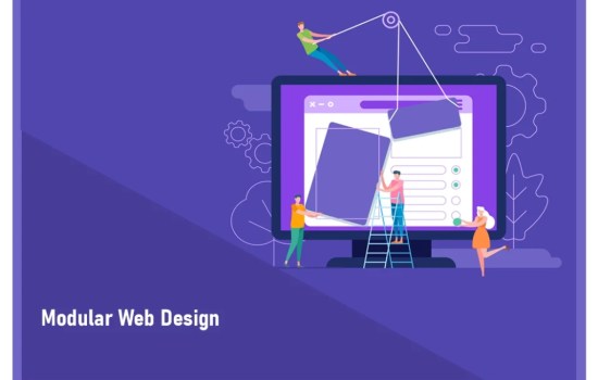
The term “Modular Web Design” describes a collection of reusable parts, blocks, or page components that provide you the freedom to create pages for your website on the fly. A module-based design approach is used in modular web design to organize online pages. These modules are constructed from branded elements that are used repeatedly on the website. Other parts of the system utilize the same header, button, data field, and backdrop color.
Modular Web Design allows for a great deal of flexibility in terms of growth, evolution, and scaling. This allows you to develop pages that address both current and future company demands. One of the modular design’s standout characteristics is its scalability. Furthermore, you may add freshly constructed modules to the current collection. This decreases the overall budget of website development while offering a fresher appearance to the content and ensuring that website is always evolving.
FLAT DESIGN

Flat design is a web design style that uses basic 2D icons, vectors, graphics, and other visual elements in bright colors. This design philosophy grown in popularity as a way to assist responsive designs operate better across many platforms and load faster at sluggish Internet speeds. Flat designs improve user experience by using simplistic graphics that deliver clear signals to consumers. Using bright colors with clear contrast in flat designs also aids in navigation and user guidance.
Flat designs have a sharpness and clarity that only comes from eliminating 3D elements. The major goal of this design concept is to accept the limitations of the device and work within them rather than trying to distinguish them. This characteristic is also utilized as a rallying point for streamlining designs and rendering websites more useful and fast.
USE OF ILLUSTRATIONS

An excellent substitute for websites’ static graphics are illustrations. Put simply, they help differentiate a brand from the competition considering that they are less repetitive than stock photos. They may be employed in step-by-step illustrations or infographics, which makes them excellent for aiding in the explanation of abstract subjects. Illustrations are a creative method to communicate the website’s brand value of diversity and to show, rather than tell, those who are accessing it.
NEGATIVE SPACE

A great design occasionally involves both what you include and don’t include. For this reason, Negative Space is one trend in design that will always be in vogue. Negative Space is a bare, empty area without any objects. Another name for this design principle is White Space. It is a simple approach to draw attention to anything that needs to stand out and be the focal point. It conveys a sense of space, making a web page appear airy and uncrowded. Additionally, it’s a fantastic approach to improve visual hierarchy and give the website a strong framework.
Designers can emphasize website items by using negative space. Without adding any weight, it effortlessly directs website visitors’ attention to what is crucial. This increases their propensity to take in and remember important information. Additionally, it’s a fantastic technique to segregate out different portions.
SPLIT-SCREEN LAYOUT

Split-screen layouts are a preferred design choice when two characteristics must have equal merit on a page and are typically used in designs when both text and an image must be noticeably highlighted. Positioning them adjacent to one another rather than vertically, or with text overlaid on top, is a deliberate design choice that may provide a smart, minimalist feel. Two photos side by side, occasionally with text overlays, are also frequent.
Split-screen designs are ideal for product pages and catalogs of e-Commerce websites. Photographs of featured products must be visible on these pages, along with important information such as pricing, specs, add-to-cart buttons, and product alternatives.
BOLD TYPOGRAPHY

While the backdrop, graphics, and color schemes establish the tone for any website design, it is the typography that speaks for itself. When fully coordinated with the website’s written content, here is where your unique selling proposition can really shine. Bold typography works fantastically in website design as it emanates authority in communications, assisting firms to stand out and build their brand. Bold typography stresses the principle of conveying more with less, and it is perfect for supplementing stark minimalist websites by adding contrast and visual intrigue.
FINAL THOUGHTS
Regardless of the numerous trends in web design, these classic design principles are still relevant even today. By adding your own creative touch, you may create a website that endures and stands out from the crowd.
At ATC ONLINE, we have the experience and talent to provide cutting-edge, highly responsive design for Websites and E-Commerce Portals. For more about ATC ONLINE’s Website Development Solutions & Services, please visit us at: https://atconline.biz/products/web-design-development/
You could also contact us at https://atconline.biz/contact/ for business enquires and product information.


